A curated collection of logo designs of 2025,
Showcasing versatility, creativity, and brand storytelling.
Each mark is crafted with purpose to reflect identity and impact.
Jan 2025 - Present
Yet to add more
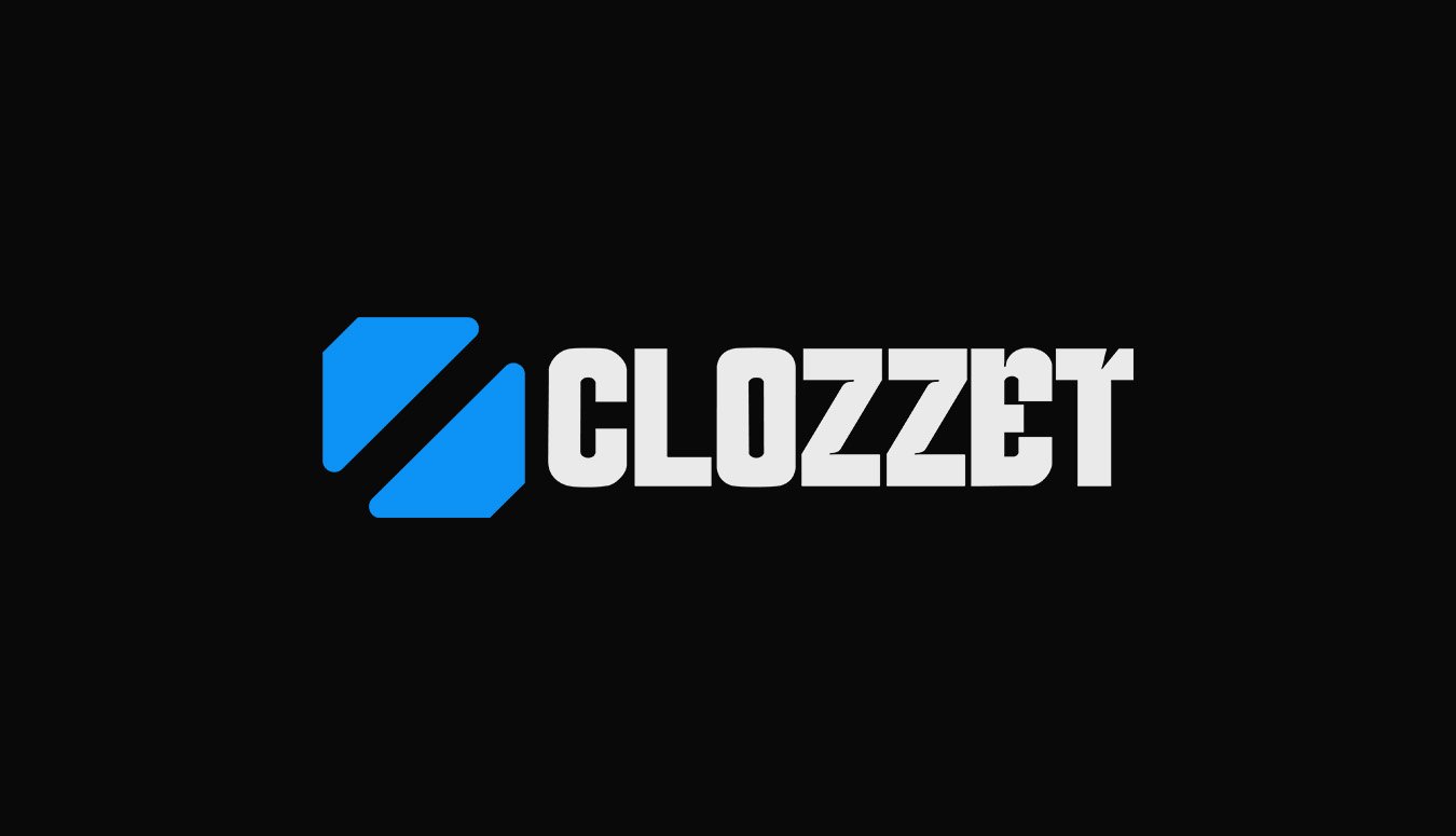
Clozzet
The Clozzet logo captures the essence of a hyperlocal, quick-commerce fashion app with bold creativity. Each letter in the wordmark features a distinct style, symbolizing the diverse fashion expressions found across neighborhoods and individuals. The modern, geometric icon alongside the name adds a sleek, digital-first identity-hinting at speed, tech, and convenience. This logo isn't just a brand mark-it's a reflection of how fashion comes in many styles, and Clozzet brings them all to your doorstep, fast.
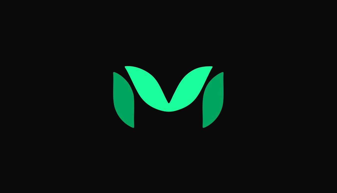
Mother Nature Nutrition (MNN)
The MNN logo embodies the brand’s core values-nature, wellness, and balance. Shaped like the letter "M," the mark is constructed from smooth, leaf-like forms, symbolizing purity and natural growth. The gradient green tones reflect vitality and harmony, rooted in Ayurvedic tradition yet designed for the modern world. Simple, clean, and organic, the logo visually communicates MNN’s mission: delivering clean, science-backed wellness with the goodness of nature.
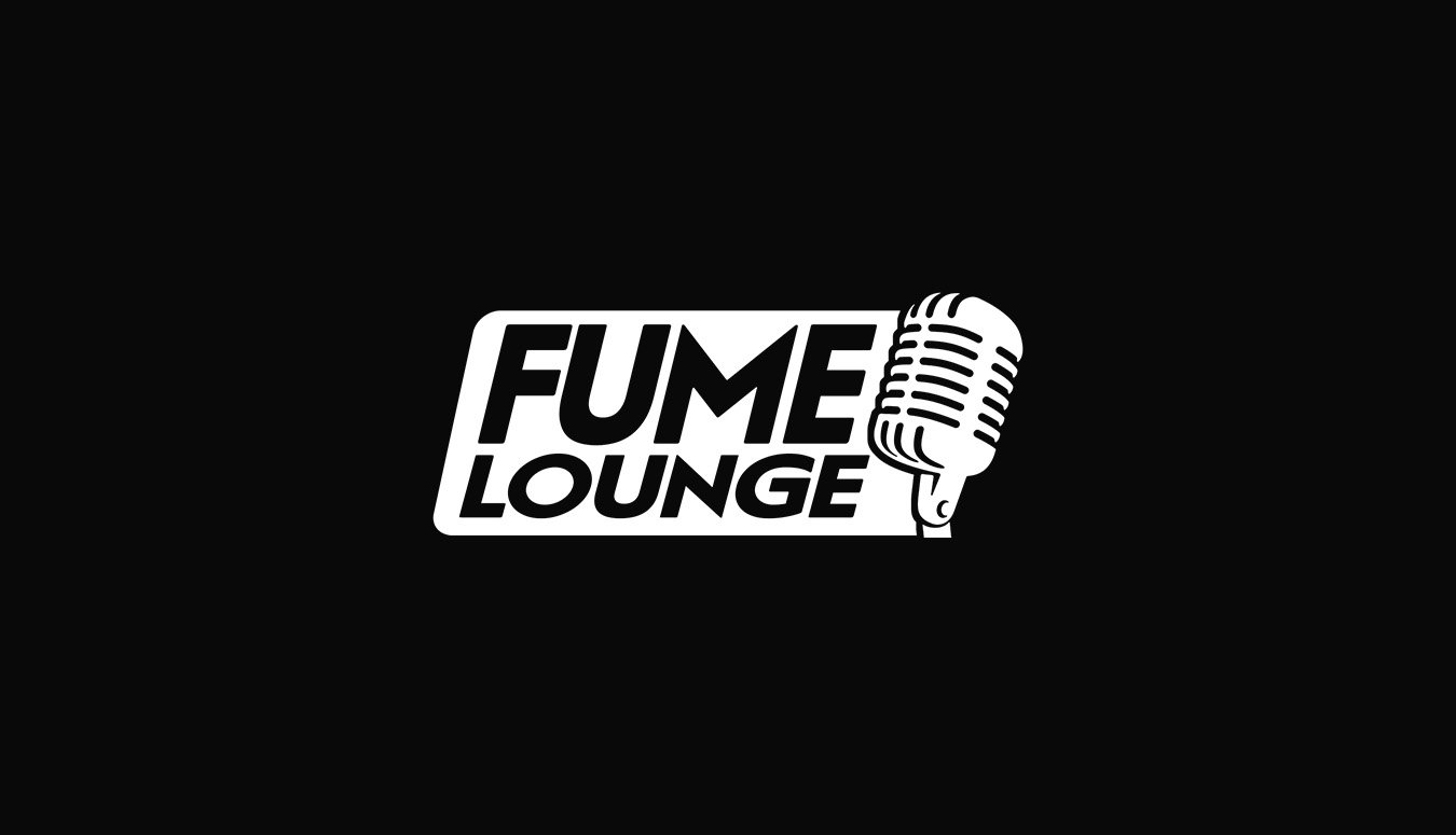
The Fume Lounge
The Fume Lounge logo pairs bold typography with a classic microphone icon, perfectly capturing the podcast’s focus on voice, conversation, and storytelling. The strong, clean lettering communicates confidence and clarity, while the mic symbolizes authentic, unfiltered dialogue. Designed in high-contrast black and white, the logo reflects a modern, professional vibe-fitting for a show that dives deep into lifestyle, entrepreneurship, and innovation. It’s a bold visual identity for a platform built to inspire, inform, and spark meaningful conversations.
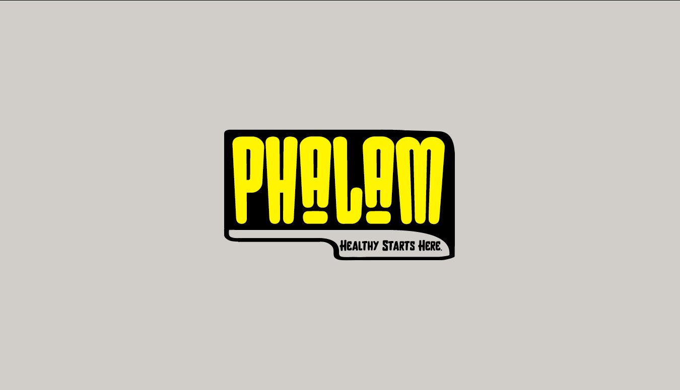
Phalam
The Phalam logo bursts with energy and freshness-just like the salads it represents. With bold yellow typography and playful letterforms, it captures the youthful, vibrant spirit of a brand built on healthy living. The quirky shapes and spacing of the letters create a visual rhythm that mirrors the variety and color of a well-made salad. The tagline “Healthy Starts Here” sits confidently below, reinforcing the brand’s commitment to nutritious, subscription-based salad delivery. This logo is fun, memorable, and rooted in the idea that wellness can be both easy and exciting.
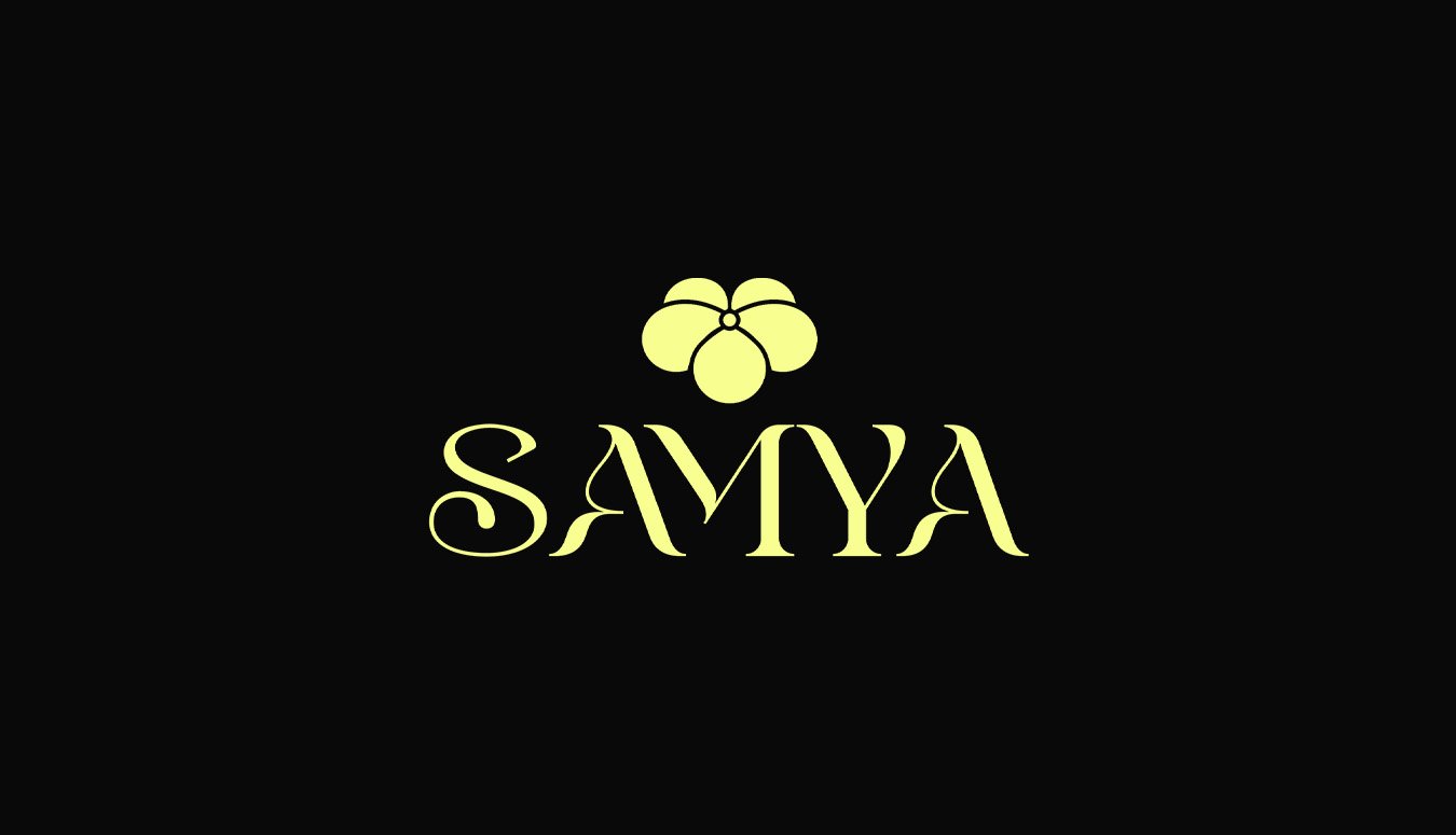
Samya
The Samya logo reflects timeless elegance and cultural richness, just like the traditional attire it represents. The graceful, serif lettering evokes a sense of heritage and femininity, while the delicate floral motif above adds a soft, ornamental touch-symbolizing beauty, tradition, and celebration. Designed for a brand that offers sarees and ethnic wear for both weddings and everyday grace, this logo captures the essence of Indian tradition in a modern, stylish form.
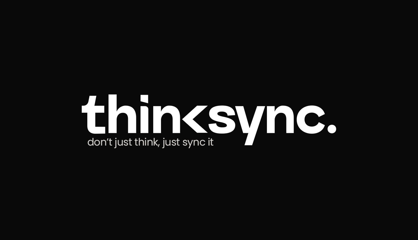
Thinksync
The Thinksync logo is clean, bold, and modern-perfectly reflecting the agency’s digital-first mindset. The clever use of the "less than" symbol between think and sync visually represents connection, flow, and forward-thinking strategy. With the tagline “don’t just think, just sync it,” the brand emphasizes action, alignment, and seamless integration. It captures what Thinksync is all about: syncing ideas with execution across social media, branding, web design, and digital marketing for impactful results.
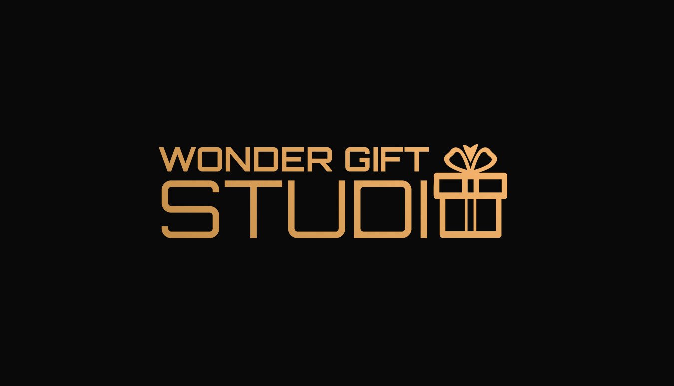
Wonder Gift Studio
The Wonder Gift Studio logo blends elegance with warmth, just like the gifting experience it represents. The sleek, golden typography gives it a premium feel, while the gift box icon smartly integrated into the word STUDIO adds a playful and memorable touch. With its clean lines and modern style, the logo perfectly captures the brand’s essence-celebrating thoughtful gifting through a seamless e-commerce experience.